Emily Henderson / House Beautiful
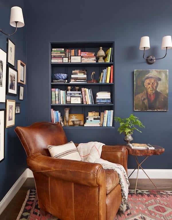
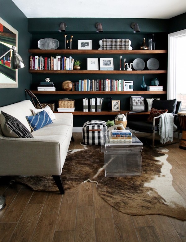
I have always added a mix of light + dark in every home I have lived in. It’s partly because I decorate in all seasons, and maybe because can’t make up my mind on the mood I love the most (light and bright? cozy and moody?) but partly because the complexity of moods is what I love and feel the most at home with. I probably wouldn’t be happy in a totally dark and moody house, but if it was all light and cheery I’d feel like it was missing some depth, richness and contrast.
Usually I have a mix of light and dark all in one room, but I also find it creatively interesting to experience various moods as I wander through the house. The “moodiness” of a room doesn’t have to come from dark walls, of course, it can be achieved through darker floors, a mix of richer furniture, antiques, fabrics, or painted cabinets, too.
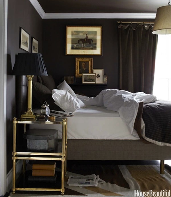
Moody rooms might feel more appropriate in certain styles or even locations and settings of a house. Our house has a lot of natural light at the back of the house and dark wall colors would feel washed out, so a lighter mood really works best in those rooms. But our bedroom feels so cozy with darker walls! It has enough light to not be dreary and is small enough to feel cozy. I love the mood of our bedroom (incidentally, Benjamin Moore just selected their 2017 color of the year and it looks so much like my bedroom walls!).
You might feel that creating a much lighter mood inside is a way to balance out a darker “mood” you might see outside in the winter. For instance, in the Northwest we have a clouds, rain and a darker natural environment in the winter than say a state like Florida does. Some people feel if they live in a darker climate that decorating with a more “summer” mood will help elevate their personal mood when it’s gray outside.
For me I feel best when the mood of our home feels inspired by and incorporates aspects of the mood in our natural habitat here in the NW. When I’ve attempted to select brighter, cooler or clearer paint colors like I might see in homes in Florida, as an example, they don’t seem to work as well here. I tend to feel more comfortable with colors that have slightly warmer or more gray undertones.
Selecting moods that bring about a cohesiveness inside and out feels more settling and comforting to me. But I couldn’t have an all moody house that only feels cozy in the winter. I prefer to balance the mood of our winter with lots of warm whites to help reflect more light and spread more cheer around the house. As the seasons change in the NW, a more balanced mood helps my home to evolve easily with the seasons, too.
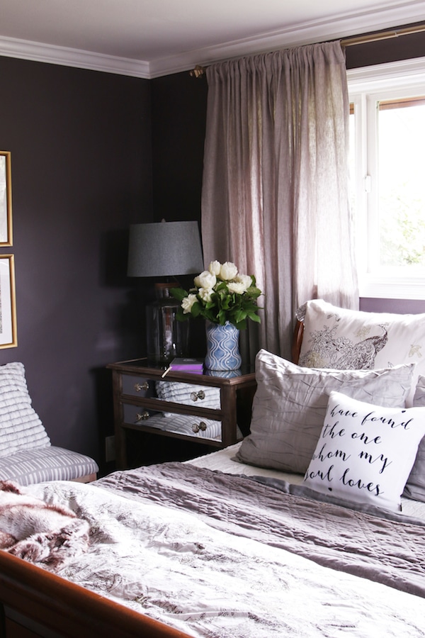
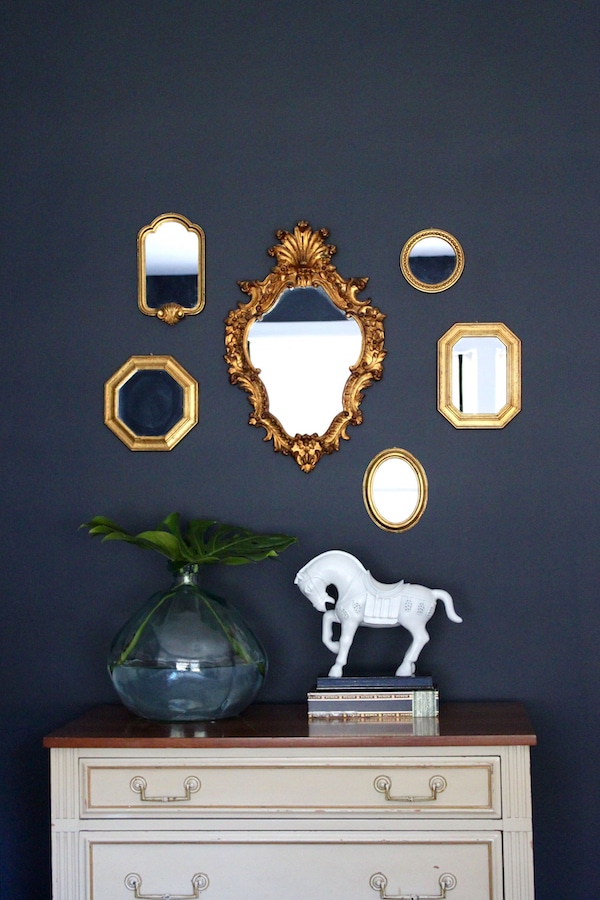
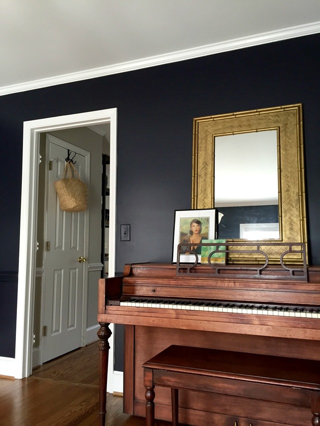
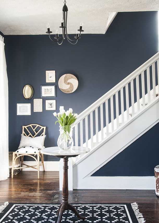
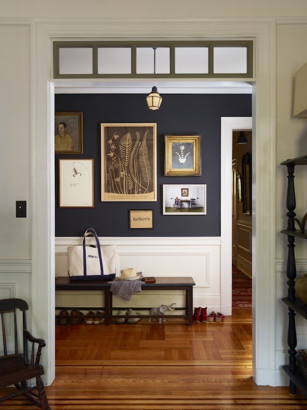
My master bedroom (color: Glidden Black Frosted Plum)
 Tali Roth for Design Sponge
 Weekday Carnival via Design Love Fest
Photography by Philip Ficks; styling by Pam Morris via Remodelista
Do the natural surroundings throughout the seasons where you live tend to impact or influence how you decorate? Let’s chat in the comments!
More posts:
My Fall House Tours from my previous home


My home is still in transition. For a long time I didn’t know what I wanted, so I left it the blank slate it was when we moved in almost 10 years ago. I find it difficult to make decisions on home decorating – I want it to be comfortably, cozy, and still stylish and functional. I live in central North Carolina (a short drive to the coast) and I grew up in Michigan (5 miles from Lake Huron) – water and coastal regions are my comfort! Right now I am in the process of decorating my home that brings that comfort inside … not quite like my surroundings, but close by.
I live by some of the most beautiful beaches and turquoise waters and they do influence my home’s decor. I have lovely ocean green accents used with taupes and other neutrals. Yellow, gray and blue in my living room. I also collect turquoise colored pottery, Metlox and Harlequin Art Deco pieces from Homer Laughlin for those pops of color. Wish I could show you pictures! Your comment section doesn’t allow it though ;-)
I need light, light and more ligth. Live in Scandiavia, where winter days are short and usually rather dark. So I have white walls and white curtains and white lampshades and white painted tables and book shelves, but grayish/black upholstery on sofas and chairs, so that it does not end up looking like a beach house, lost in the winter :-)
And of course lots of plants and books (and chocolate…)
Being a fall-color person (pastels wash me out), I found the moody colors in this post sooooo appealing! While most of our walls are cream, our furnishings tend to be moody: black leather, deep gold, forest green, merlot. I try to create a good balance of light and dark with neutrals, brass accessories and vintage photos and art, but never throw in a pastel or neon color…just not thing. :)
:) sounds perfect!
I love moody rooms. I’m like you though, I need a mix. We have a lake cabin. It is tiny with only 6 rooms. I would love to paint my bedroom a dark, moody color but you can see the two bedrooms from the main living area and they do not get a lot of light. I painted the main living area Manchester Tan, Ben Moore. I guess I feel like the two bedrooms need to be the same color or a lighter color. I was considering Sea Salt by Sherwin Williams. What do you think if I painted just one bedroom a darker color? Would it look too choppy?
I think you can go dark in one, but it helps to find some connections to lead your eye comfortably into the darker space. A darker throw pillow in the lighter room, for instance, can sometimes make the connection feel more seamless and intentional. And maybe a light accent in a complimentary color the darker room can complete the connection and create a good color flow. :)
Our house backs up to a small lake, and we have several big trees in our backyard, so our house’s “theme” is trees and water. I love the colors of the tree trunks – grays, browns, black – the changing colors of the leaves, and the tempermental color changes in the water – blue, green, brown, silver, etc. So our basic colors tend toward the “tree” neutrals; pops of color are typically red and orange (autumn leaves); and we have tree- and water-themed artwork around the house. We also have lots of wood (varying tones), metals, and stone – lots of natural materials. It definitely reflects our surroundings and favorite season! Fun post!
That sounds so lovely!
I live in Minnesota where the landscape is often white with snow, so I prefer decorating with anything but white (even though my Pinterest boards are filled with white rooms). Currently most of my walls are Sherwin Williams “Silvermist” — a neutral gray-green that seems cozy but not dark.
Each season I bring some of the outdoors into my home. Currently I have dried goldenrod, a pumpkin, dried branches from crabapple trees, found feathers, pine cones, various nuts, and the remnants of robins’ eggs — all collected while walking my golden doodle. I also have sea shells and rocks collected as mementos from France, Mexico, the Caribbean, and Florida.
Our Creator is my favorite decorator!
Me, too! Natural decor and inspiration is the best of all. <3
I like sunny myself. But I am grateful for moody, dark restaurants and cafés, where I can go and indulge in the coziness as needed. Same thing with crazy colorful bohemian places and supremely austere modern ones. I wouldn’t want to live in them, but I love to visit occasionally.
For years, my preferred interior style has been all about light and airy. Still lean that way but, lately, the moody style is very appealing to me. Especially when I see pictures of rooms like the ones posted here! So, as I’ve been decorating our newly renovated house on the lake, surrounded by our wooded landscape, I have begun to strive for a balance between the light and airy white walls and big windows with black accents such as wire mesh kitchen chairs, black kitchen counter stools, a few black and charcoal grey throw pillows on the sofa, etc. I feel like when I add some black or dark details, it helps to give a sense of grounding everything else in the room.
Yes I agree, Vickie, the dark can be grounding and I think that’s comforting. Your home sounds lovely!
Thank you for posting these beautiful dark (moody) rooms. This end of the spectrum is seldom seen on blogs – there is soooo much white everywhere. Moody does not mean dark and dreary to me, especially with the white woodwork that I do love. The moody paint colors make me feel calm and secure. I have them all over my house and only change out my draperies (from winter heavy to summer sheer), bed linens and throw pillows as winter morphs into spring and summer.
Calm and secure is a good description of how one could feel in a moodier space this time of year! They feel quiet and calming to me, too. In so many parts of the country the weather tells us it is time to nestle in and get cozy!
So interesting to read your thoughts about moody colors and those of other readers. It’s so individualized. I crave sunlight and “light and airy”. My 1986-build home here in sunny desert southwest Arizona has big windows which look out onto a greenbelt with trees (developers felt that no one wold ever retire to the desert unless they made Phoenix/Sun City West an “oasis” thus beautiful green but totally unnatural grass and trees. Despite the large windows, my house has eaves which means I get direct sunlight for only a short period of time at certain times of day and my house is always shaded. The one neighbor who did “intense” color created a designer-look home that is extremely claustrophobic and unsettling to me (deep blue and orange walls (not relieved by blue and white toile everywhere, and expresso laminate floors). Other neighbors who have redone their floors (the biggest change most make) have gone with brown laminate floors and I feel as if I’m standing in a cave looking out toward the entrance (I don’t like caves.) My new floors are going to have to be similar to the floors in your house now, Melissa – it’s what makes my heart happy. That being said, I can appreciate elements in each picture above and I can visualize each reader’s description of her home. A very nice study in color and mood over the morning’s first cup of coffee.
I can imagine how you’d feel claustrophobic and like you were in a cave there in Arizona with dark and intense colors. It is so important to assess your home and where you live and how those nuances of color and light can alter your mood! <3
When I saw the new BM colors for 2017 I immediately thought of your new wall color, too. :)
Seriously, there are a LOT of beautiful colors in the 2017 BM lineup. I do love those moody colors and your bedroom is amazing. I tried going coastal in colors and as much as I loved it… when September came I felt drawn away from those watery breezy tones. I’m glad I tried it… but now know that look is best used in accessories for a light neutral scheme on a seasonal basis. The experiment was so worth it. :)
Have a blessed weekend my friend!
I know the feeling! Glad you found a balance that works for you! <3 have a wonderful weekend, Diane!
I love dark, rich colors! My home is filled with intense shades. It’s just too cold here in the Chicago area to go light and airy- although I love that look in CA or FL. I find a dark room very cozy and find the cave-like feeling quite comfortable. I find rich colors are great for dark rooms, making them really come alive, whereas white would just look dingy and dirty. Lighting the room well after dark, can also complement a rich color beautifully.
Being a Florida girl, it’s light and airy for me. I tried to go darker in our NC mountain cabin, but settled on a medium sage-y green for the living areas. Dark=Depressing to me. Accessories, yes; Walls, hmmm, not so much.
I also live in the pacific NW, and have mostly a moody color scheme too. Feels cool (shady) in summer, warm and cosy in winter. My bright colors come from my all white/green “moon” garden scapes. My house is even painted black with rust brick and cedar shingles for accents. I agree, a light bright beachy feels just seems out of place up here in the NW. Most of my friends tend to decorate in the moody shades too…….never thought of it that way….you’re on to something.
I love “moody” jewel tone colors. My home in NJ had a beautiful deep moody burgundy painted upper wall with a very pretty cream color on the bottom separated by a cream painted chair rail and picture frame mo,ding and cream colored ceiling crown molding. I LOVEEd that room in the evening..it was so beautifully lit and cozy and friempnds & family loved being there. Here in Southern Delaware, the weather is more mild and we live in a coastal town so our newly built home is painted neutral beiges in the kitchen, dining room, and library with the LR in a deeper shade and the whole house has bright white trim, baseboards and crown molding. It’s all open concept and we like it. It’s nice and air as well as cozy in the evening. We took great lengths in designing how all rooms were lit and that makes a lot of difference, we did do 2 of the three bedrooms in a dark blue along with all 3 bathrooms and with the white trim, etc they really pop! Glad I was able to incorporate some moody colors in some rooms!
These darker rooms are so elegant to me… and they exude a quiet calm in their elegance. For me, though, I always gravitate toward the warmer and lighter colors for my walls. I have Provence Cream in one room (roughly the shade of real butter), I have Moonlit in our bedroom (a glowing off-white with the softest hint of yellow), I have a golden-yellow textured wall in my kitchen reminiscent of Tuscan plaster, and in my new downstairs den (described in my latest post) the walls are a soft ivory. I think I am drawn to the warmth and the joyful feeling I get from these colors. Now, if I can just come up with a great color for the walls of my den… currently white.
Hi,
I have a low ceiling basement (2.1 metres) which I am looking to convert into a cinema room. I want to give it a moody cosy room. I love the idea of dark herringbone wood effect vinyl flooring, could I go dark on the walls too? If so what colour would I paint the ceilings? I am so confused.
Many Thanks
Bal