Creating Visual Flow Room to Room
Ilove when rooms flow, as in when you can be in one room and look through it to a hall or another room and you aren’t jarred by something that looks wrong or undone. I don’t mean my home has to be perfect, but having a flow from room to room gives my home a certain feeling of peace that is really important to me. Even though we’ve been painting rooms at our house for the past couple of years, FINALLY we are starting to see glimmers of that flow I’ve been wanting. Granted, I still have quite a ways to go in furnishing my rooms the way I want. All in due time, right?
Just being able to look from my bedroom, for instance, to the hall, to my daughter’s room and see that colors are starting to feel pleasing together (good-bye, swine) and seeing the wood floors connecting the rooms instead of the carpet I didn’t like… OH MY HEART just does a little happy jig at how pretty it is turning out.
Foundational elements like walls and flooring really make such a difference in how a house feels! Once you get those things right, other elements start to fall into place.
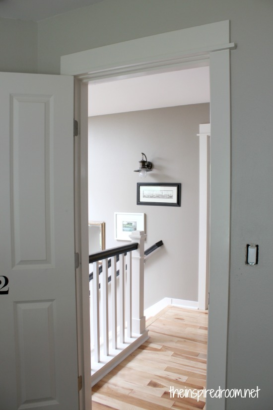
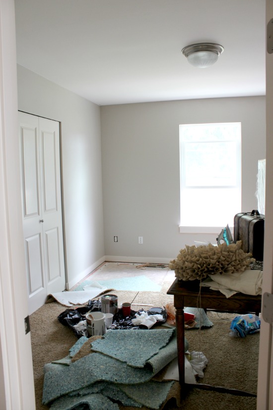
The picture above is from my middle daughter Courtney’s room looking out to our stairway and upstairs hall. She just painted her room this weekend (another swine room DOWN!). Courtney’s room is now the same color as the hall, which is Studio Taupe, BUT lightened with roughly 2 parts white and one part Studio Taupe. It’s a bit hard to tell in the picture above, but her room is quite a bit lighter than the hall. We are really happy with how the color turned out! You can see the color variation a bit better in the picture below.
PAINT TIP: By taking a darker paint color used in one room and adding white, you can create a new complementary color which can create a nice flow to an adjoining room without changing paint. In our case we mixed the exact same paint brand and sheen of paint (satin) to ensure the paint went on smoothly and evenly when mixed together.
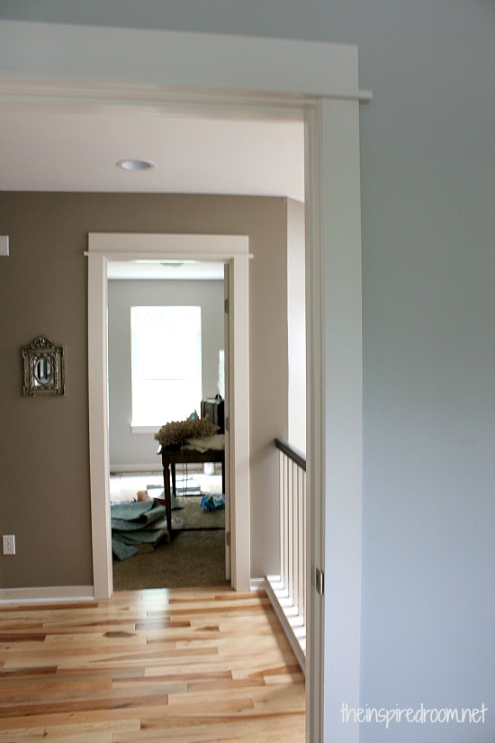
This picture, above, is looking from our bedroom, which is kind of a blue-gray (Glidden Wood Smoke, lightened) to the hall into my daughter’s room. Wood Smoke, lightened, is not the same as Studio Taupe, but it is a really nice soft gray with a bit of blue. I really like the variation from the brown based gray to the blue based gray. I’ll have more pictures of my bedroom progress in an upcoming post, but I am really happy with the color.
On Monday we are having this room measured for new cute but affordable carpet and I’m super excited about that too because it will finally complete the flow of the rooms at the top of our stairs. Plus, by redoing this bedroom we are making way for our new sectional in another room. Long story (sheesh, I’m trying to keep this short), but my daughter has switched bedrooms TWICE since we’ve lived here and she is moving back into her original room so we can use the bigger bedroom for an upstairs family TV space and hangout room for our son and his friends.
As a side note and decorating tip, I don’t think all the rooms in a house need to “match” in order to flow. I happen to like a little more variety at my house, so while using all one paint color or intensity of color throughout would be simple (or sticking with all white) and would definitely create a nice flow, I find I get a little bored unless there are some creative surprises as I walk through my home. I like the variations from subtle color changes to a few dramatic changes (such as the more vibrant blue color of my office).
Good visual flow can be achieved in connecting rooms (even rooms painted different colors!) with well-placed accessories, furniture choices, and fabrics too. I suppose I can talk about that more when I start getting furniture and accessories set up again! We are getting closer to that phase of our redecorating season and I can’t wait!
Do you like your house to flow from room to room?
How do you achieve that flow, do you like rooms to be all the same color or do you mix things up a bit?


All about the “flow” here! Causes distress when daughter wants her room, which is visible from practically EVERY spot around, a jarring color. How do you handle that? (She has now moved out to college, but I bet this has to be an issue for others.) I can’t just close the door. :)
I’ll do a post on this :-)
I’d say Go with the color! My daughter, also 20 and off to college, wanted a pink…pepto bismol pink room when she was little. Just couldn’t do it…gave her a soft (boring) yellow. Finally as a teen I let her pick out her colors (witha little guidance) and it’s now lime green and royal blue. I regret to this day not letting her have that jarring pink room….and the red glitter shoes she wanted that I didn’t get for her.
Love that you mix the paint colors with white to get a complimentary hue!
When my kids have wanted jarring colors on the walls of their rooms I’ve told them, “Wow! That is so cool! And you can do that someday when you own your own home!” Those responses help launch children and clarify why they don’t want to live with you forever.
To create flow in my house I try to work from a smallish pallette of colors. Then I emphasize a different one or a pair in each room. My base colors are tan, gray and white. Variations on those themes with red, pinks, blues, even oranges, all look swell. The bedrooms stay the calmest….;<)
Loving these colors!!!!!!!!
I like when other peoples’ houses flow, and especially love watching how things are unfolding so beautifully in your home, Melissa. But I’ve always craved color, usually dark, different jewel tones, since I grew up in a house in SoCal where all the walls were white. I break the rules and choose to make each room different, not flowy. I like to walk from one room to another and feel the “wow!” this is so different from the last room. I know I’d be a decorator’s nightmare, but the visual change and punch pleases me. :)
Julie, I don’t think the paint has to match at all. I mentioned at the end of the post that a home can flow in other ways like through use of fabrics. If flow is what you like :-). I don’t think you should follow the rules either, because who makes those rules, anyway? :-)
Oh yes, I do love the flow between rooms and I love sitting in our front room and look through the diningroom (same colour as the livingroom) and then through the pass-through to the kitchen. If I look to the left I can see through the French doors to the front hall and the stairs – all a lovely mix of colour.
Melissa,
How do you put type on a picture (like when you draw an arrow and say “here I am going to put _____”? I am looking for tech info, here, please :-) I am remodeling and want to be able to send pictures with text to my contractor! Thanks!
Lisa
You can use picmonkey.com. It’s free. Just upload a picture and then use the geometric option and find the arrows. The text option will give you the space for words! :-) good luck!
Hey, thanks so much for the quick reply! I really enjoy your blog and the pictures and the way you write!
One more question, Melissa…what is the name of the font you use?
Thanks!
Lisa
Thanks!! I think in picmonkey I use one called shadows into light? I think? But i sometimes mix up the fonts for titles or captions or whatever :-)
I loved this post!!! I am always thinking about this issue and trying to see if the flow in my house is working. It think sometimes it can be hard to visualize the overall flow before you totally get started, but I love when it ultimately comes together and works. Your house looks great and I love the colors.
Thanks Jocelyn, it is hard to visualize before you get started but it is so fun once you get on a roll :-)
What brand paint is the Studio Taupe? The rooms colors are beautiful. I love your site……..thank you
Thank you Sue! Behr makes Studio Taupe but you can have it mixed in whatever brand you like.
Thank you
Good morning, love the flow of color, but you didnt mention the color of the new tv room—–the one with the new carpeting being installed ? Thanks so much, it looks like a lt gray……….
Thanks so much for the wonderful pics and advise—-
The room with the new carpet is actually my daughter’s room, and the color is Behr Studio Taupe, lightened. It was roughly a little over 2 parts of white paint with one part of Studio Taupe. Hope that helps! The new TV room will be shown in a few weeks when we get our sectional! Yay!
Oh, thanks so much, went back and looked at the pics and noticed that in the first pic, you can see the carpet pad, sorry for the oversight……..One other question, how do you do equal parts of white, is this done at the counter, or do you do this yourself…………..?
No worries, it was kind of a rambling post. I’ll do a post with all my new paint colors soon so it is more clear. On the how to mix the paint question, we just used a container at home and scooped out maybe two and a half plastic cups full of white paint and one plastic cup full of Studio Taupe. That is our rough measurement. You can totally do it at home, but just to be safe we used the exact same brand and sheen of paint, one white and one studio taupe. Mix it up until it looks right to you and you’ve got a pretty new shade! :-)
I cant tell you how much I have enjoyed your posts….we are in the middle of moving from our 150 yr home in the country, back to our home in the city—long story, very heart wrenching, but trying to muddle through all of this. Anyway……I am trying to recreate what we have had here at the Ranch and the city home has less windows, which means not as much natural light as before…….muddling along, but oh I so appreciate your input. I have always used a sort of white paint for my trim and windows, but since we are going for lighter, (grays, taupes, etc) dont know if this is a better way or a creamier one—suggestions appreciated. :)
Oh my gosh! I am so excited that I found your post on Facebook this morning! I love love love your flow of color and I am need of some serious help with a color issue. I have an open staircase in my home that when you are in my foyer you see the hallway wall upstairs. I painted the hallway Sherwin Williams Quiksilver and I adore it in the hall upstairs, but on the walls going downstairs I do NOT. With the natural light it looks a pale baby blue and not a good color in the foyer. My question is – can I paint the walls going downstairs a different color even though you can see the transitioning wall upstairs?? I know it’s akward because there is no architectural element – but I am at a loss of what to do. Do you have any suggestions? P.S. I was hoping to use a sand color – I have a lot of water and beachy tone colors in my home… THANKS!! Stacey Hoops
Well, the short answer is yes, you can change colors. I prefer not to change colors on a wall that has no transition or corner if I can help it though because it kind of drives me crazy to see paint colors change for no apparent reason. If you can change it at a corner that is a better way to go. Are there other walls in the entry where you could change colors and maybe just leave the connecting stairwall the same as the hall? If not and you really want to change colors as it goes down the stairs, is there a way you could add a strip of molding to create your own little transition in which to change colors? Hmmm…. there must be a way you can do it!
There is a corner actually. I should explain a bit better. (Note: I do not have a way with words when I have to explain architecture!) When you reach the top of the stairs you can either go into the kids’ bath straight ahead or left down the hallway to the bedrooms. So if you are looking at the stairs going up in the foyer, there is a corner where the hall wall meets the stair wall directely at the top of the stairs on the right side. If I switch colors from my silver in the hall to a sand color going down the stairs I won’t look crazy?? :) Thanks again –
Oh good! Yes, I think if the colors look good together than you should be fine to switch colors! Lighting is so funny that even with the same exact color no two walls at my house look the same all the time. I swear they are different colors different times of the day! :-) Good luck, let me know how it turns out!
Thanks soooo much! I am now actually looking forward to fininshing it :)
Stacey~
Melissa~
I can’t tell you how I’m hanging on to every word in these redo/renovate post. We’re almost certain we’re trading in our maintenance free living for the 1930’s cottage if everything works out. Honestly. I’ve got to email you. This is making my head SPIN but in good exciting ways! The cottage will be almost a complete overhaul which will completely redirect our lives for the next couple of years. But. The cottages has features that give us the feel of the homes in Carmel, CA which is what we’ve always dreamed of. Thank you for sharing all that you are and INSPIRING me to GO FOR ALL I”VE EVER DREAMED OF which is living in an older home that speaks to the deepest depths of my soul.
Hugs from Bainbridge Island!
xo
LOVE your floors and the paint colors you are selecting.
I’m dying about your 1930s cottage, seriously, I would buy it if I could. :-) We wanted a 1930s cottage so bad when we moved here but there just aren’t many of them, particularly in the immediate area we had to buy in. Soooo, I will live vicariously through you. And you can totally invite me over to drool, I mean, to see it. :-)
Love this post. Working on paint colors now. And thanks for the kitchen post! I have cabinets similar to yours and all the jutting corners and odd placement drives me nuts. You inspired me to rethink possibly removing some of them!
Thanks for the great post. I’m wondering if you have the paint store add the white or if you do it yourself. If you do it yourself what’s the best method?
We did it ourselves. Just used a plastic cup to measure and an empty clean paint can to mix up the new color! We did buy white in the same brand and formula as the studio taupe, just to make sure it all mixed well and went on smoothly :-)
Yes!!! I really do like the rooms to have a flow to them…if possible. I have a one room living/dining room which I like to refer to as a great room. Doesn’t that sound like something grand and special? Anyhow…I painted it BM Old Prairie – nice light putty color. It’s light…but it worked sooo well with my mom’s old sofa and the warm floors. When I sit on the sofa I look towards the entry hall, through a wide arch. There is another arch separating that area from the actual entryway, so that allowed me to be dramatic and I choose a gorgeous deep red. I then choose a slightly deeper shade of the great room color for the entry way which has a lovely green cast to it. And then I went to the opposite end of the paint chip for one side of the hallway with a medium toned grayish green. It also looks great with the wood floors. The side of the hallway that doesn’t get any light is painted the same as the great room. I love how those very public areas came together. The colors change in tones for interest and I have that huge pop of the deep dark red on that 8 foot wide section of the hall which sorta stands alone. I love that my antique china cabinet….which has no place to reside besides my living room….is filled with my aunt’s red and white transfer and picks up the color and vice versa from the red wall….in another room but only 6 feet away. I could sit on the sofa all day and look at it. And some days, when I’m online writing, I do :D
I can’t wait to see your total transformation!!
Yes, I like the rooms to flow but often with the lighting they don’t seem to. When we painted our living room and hall an antique white, all was well with the LR but the hall looked absolutely pink. It was so distressing. Live and learn…it’s getting better!!
Melissa – I really like the idea of variation of color. When one enters my front door it is one long view from living room to dining room. I’d love a shade difference of color to define the two rooms. What would be better? Living room the darker, dining room lighter or the reverse?
Thanks!
Oh, hmmm…..I think you can go either way, depending on the mood you want in both rooms!
Thank you so much for this post! I too love a flow of colors, but also a change in colors. I love the idea of adding white to an existing paint color to soften it and give another room a different but coordinating color! We just painted our foyer Gracious gray which I love but I wanted to go up our staircase and down our upstairs hall with something similar but different and lighter. I think adding the white paint is the perfect answer!
So happy I found your blog! You have inspired me to rip the carpet off my staircase and stain (we are in the sanding stage)!
Hooray!!
it’s so hard to get an actual flow, especially after years of doing things at random. I love how this looks like!
It is hard, I’ve lived here three years and I’m still working on it!
Melissa, I love your site! I was considering using Wood Smoke for my guest bedroom but thought it might be too dark. Can you tell me how you lightened yours, or what the formula is? Your bedroom walls look beautiful! Thanks so much!
Thank you, yes I really need to do an update on the bedroom! The color has a name, polished grey. It’s just a bit lighter than Wood Smoke in the color book for Glidden! Just go to the Glidden counter and ask to see their book, or ask about Polished Grey and they should be able to find it! :-)
The best flow for me is to stand in the hallway and be able to “see” the floor in every room. Of course that didn’t happen until both kids left for college this fall… :( Other than that…high gloss bright white trim throughout.
I tend to mix things up a bit from room to room, but I do like your idea of lightening the paint to use in a hallway for example. I think I mostly achieve the flow, by bringing accessory colors from room to room in a subtle way like with pillows or wall art.
I can’t believe I only JUST discovered your site!! You’re amazing at what you do!
But for the subject at hand, I think that creating a flow from room to room is so important when you’re staging a house. But for my personal home I love to play with color! I feel like every room deserves its own “theme”. I still try to make it “flow” but having something different and unique in every room makes me just so darn happy when I walk through my home. :)