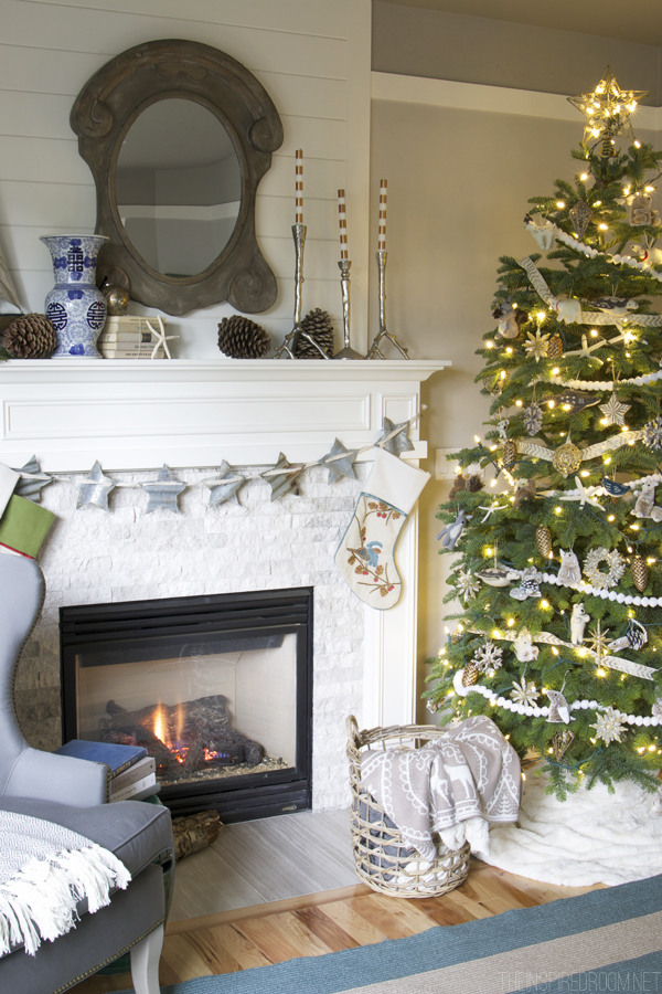
I get so inspired to work on my house around the holidays! It might be weird, but almost every Thanksgiving no matter what house I’m living in, I start painting walls. It makes for a little bit of Christmas decorating chaos, but it’s worth it :). This house is no exception, we are finishing up painting our hallway and starting our bedroom paint right now (insert a little jump for joy!). I am pretty excited to be able to get all settled into at least these two areas of our house with the right wall color for us before Christmas.
I mentioned in my last post about how the pinkish-beige color of “swine” affects me in my home. You may not even be aware of the impact of the colors in your house, especially if you have neutral paint on your wall, but it still impacts how your home feels! We (those of us who are home-lovers!) likely all have our own inner-sense of what feels right to us, whether we are in tune with it or not.
We might feel “unsettled” in a space and not realize why. We might struggle with how our house feels, and we might start to decorate a room thinking the problem must be that we have too much or too little furnishings or all the wrong accessories and all the while, it was the foundation of our room that was keeping us from feeling settled in our space.
While it would be wonderful to just visit a blog and say, I love her wall colors and I’m going to paint my whole house exactly like hers, it isn’t always that easy. It isn’t just a matter of what colors we like or don’t like. Every one of our homes will be unique, even aside from our personal style. There are so many things that impact how our own space interprets color, from the part of the country we live in, to the natural light in our home, to the wood floors, the tile, or color of carpet or tone of the cabinetry, to what colors are in the adjoining room, and more. I find it all impacts color. Even white can take on a different look in different rooms or different houses, so white isn’t always a foolproof choice.
You might see a photo of a house with all white walls and love how it looks in a picture, but worry that in your house it would feel cold and lifeless. You might fear gray or brown toned walls would look dreary in your house or believe that you would dislike colored walls when in fact that might be the right choice for your home. I might say I don’t prefer a particular shade of paint at my house, but it might be perfect in yours!
Each and every option can be absolutely beautiful when put in the right space.
When I say my walls are swine-y and that color sucks the life out of my house, that’s only how it impacts me and the things that are in my house. Remember, I live in the Pacific NW so the same colors I choose may or may not suit someone in the South, or in the Southwest, or the NE. And even if the color itself works, you’ll have to look at your own floors, your wood tones and the lighting in you home to see what exact shade makes YOUR home come to life!
A week or so ago, I visited Epcot® at Walt Disney World Resort® for a whirlwind trip to the grand opening of a wonderful new exhibit called Colortopia, sponsored by Glidden at the Innoventions Pavillion at Epcot®. I had a lot of fun, the exhibit really made the concept of color fun for kids and adults alike. My favorite part was a virtual painting booth where you got to use a magic paint brush made of fiber optics and “paint” a mural! It was pretty cool, I’d recommend you stop in next time you are at Epcot! You can see a short video of me having fun “painting” at the Colortopia exhibit, below.
Even though you have to play with color in your own home in order to make the right choice, you certainly can incorporate a color scheme you love and make it work! You should love the colors in your home. I love to be inspired by places I’ve been, whether it is a country I love, a vacation destination or a fun shop I enjoy visiting locally or even someone’s else’s home.
I recently wrote a post over on Glidden about how color can be inspired by a country you love, you can check it out here.
Places you love or rooms that inspire you can definitely inspire a color scheme. You might even find a color for your walls from a fabric you love. The secret to a successful color scheme will likely be in the color tones or shades you choose and the mix of color that is right for your own house. Whether you use a color you love on the walls or use it in another way, you will likely will just have to play around with your color scheme in a room to get it right for your house.
I’m heading back to Florida this week to see the 2016 HGTV Dream Home. I AM SO EXCITED I can hardly stand it. I’ll be Instagramming pics as I go through the house Thursday, so I hope you’ll follow along (find me here)! I’ll follow up here on the blog with a post too!
GIVEAWAY TIME!
Take a moment to visit the My Colortopia blog to decide which country’s featured color scheme inspires you the most, then leave a comment below to be entered into a GIVEAWAY! This giveaway is sponsored by Glidden. The winner will receive a $100 Gift Card to The Home Depot so you can have fun with your own color scheme! Winner will be selected at random on December 5.
As a MyColortopia Team member, this post is sponsored by Glidden. All reviews and opinions are my own.
Related:


I love the UK color scheme!
I agree so much about there being so many things that influence how a color looks in a space. I have painted three different rooms in my house Benjamin Moore Horizon and it looks a bit different in each room. In the room that gets very little natural light the walls look almost taupe. The room with evergreen trees outside the paint looks bluish and in the room that faces east it looks more aqua. But I love it in every room because I tested it on the walls first!
That’s cool, I actually love when that happens because it gives each room a unique feel but it still flows beautifully. :)
I absolutely love the colors of Japan, I am re-doing a bedroom very soon and picked the colors white, navy and tan, so cool!
The colors of the UK, please! Love this idea. Thanks for the giveaway.
Colors from the UK!
Norway’s colors please.
I am crazy about the colors (and culture, food, personalities, customs & language) of ITALY. Aside from just moving there, I would love to re-do my home in their bright, muted colors, use themes of vineyard palettes, fruit, the ocean and countryside to create the warmth, vitality and energy of Italy in my home.
I like Japan’s colors for my home! Thanks.
I did not realize it, but love France, not just the wine but the colors
The colors from the UK really spoke to me!
Color My World! I was so inspired by the Colors of America …there is the historic element, but the hues are so “me” tucked into my corner of the earth,
Norway!!!
I am inspired by the colors of the U.K. We just finished repainting our whole house with antique white and I find I am using greys, browns and teal for accent colors.
However, my kitchen is definitely Tuscan inspired with buttery yellow Venetian plaster walls, warm red brown cabinets with muted dark green cabinets mixed in, soapstone counters and sink and a beautiful glass tile backsplash with all of those colors together.
I am inspired by Norway! They always have a clean cool color mixed with that beautiful gray which must reflect all the snow they have.
Oh I think you’ve inspired me to paint one of my rooms now before Christmas!!
I love the colors of Japan! I just painted the door to my garage in glidden paint color matched to beach glass. The quality of their trim paint with the sheen and smoothness of the application is unbeatable!
I am decorating challenged, but always thought “I know when I see it”. The Canada colors are the ones that I had an instant reaction to, and I like them upon further consideration. But I like your Japan colors too. I feel like it would really make a difference with the style of home, I guess?
Colours of France, and a surprise, Colours of Norway.
Hello and Thank You for your wonderfully inspiring posts and the opportunity to enter into a give away from Home Depot, one of my favorite stores! I would have to say that the colors of the UK are the most inspiring for me. I wish it were Italy since that is my dream place to travel but in truth I find the colors of the UK to be more relaxing and pull out my inner me. These are the colors that make my home my happy place.
I am loving the UK color palette as inspiration for my basement that I’m currently getting ready to repaint/redo! The neutral tones with the pretty pops of color are beautiful! Thanks for this giveaway!
I am drawn to the colors of Norway. I have painted many of the same colors in my home right now. They give my home a feel of soft, warm and clean that I like.
I love the colors of France. Those gray tones are so beautiful and adding the pop of the purple – love it!
I enjoyed looking at the colors representative of each country, but probably gravitate toward England as my favorite. I am working on my own house in trying to fine colors that will flow, so thanks for the inspiration.
Diane
UK!
No surprise … that’s where my dad came from!
;-}
My husband is definitely stuck in the colors of Japan. I still have not found my country! It would include a “candy apple” red. We compromised by painting one red wall behind the front door, (it fools you into thinking there is another room back there), and one at the end of the hall, (that one draws your eye in that direction and makes the hall appear longer). Our home is 640 square feet and I use every trick I can to make it feel larger. I like to place mirrors across from, or adjacent to, windows to reflect the light and the trees.
I like the colors of the UK. Hope I win the prize!
I like whispering wheat. Thank you!!
I love the Moroccan inspired color palette!
I think we are very Asian inspired in the PNW due to the beauty that is also found in the far east country of Japan. It is starkness but with a sense of warmth and embracing the simple and nature itself. My city home is all Japan and my island home is Norway, as it should be since it is surrounded by water. I agree that colors are the strongest message of a home. Thankfully, our next door neighbors in the city have decided to redo their house color scheme (charcoal gray roof done- Cornflower blue and ivory trim house next spring with charcoal doors!) and it will really now go with ours (light gray house, charcoal gray trim but no roof shows from modern approach and same color Cornflower blue doors). When you only have four neighbors on a private drive, color scheme is very important. I almost wanted to say that as we went around saying what we were thankful for during the T-day feast. I did not even discuss it with them… happy dance~~~ and we just added the green doors (trim to come) for the island homes. Would do more outside but the rains of winter are upon us. Now we will concentrate as you have on our inner color scheme.
I like the colors from Canada. Would love to see the exhibit at Epcot! Hope I win the 100$
I loved the colors from Japan. I like the way it is paired with neutral tones of white and cream. Blue is the one color (besides white) that I feel is timeless and makes me feel relaxed and at home.
Love the calm and peaceful blues of Japan. Thanks for some interesting new ideas on color.
I especially liked the Norway inspired colors. I liked the natural element and warmth they bring To a room. I have always been drawn to that color pallet.
Morocco! Love the warm, bright colors.
I am most drawn to the colors of Japan. I have always loved blue. The shades have changed with the years, but it’s always been an integral part of my home’s color scheme. And it’s perfect with creamy neutrals for a soothing and comfortable home.
I love the colors from the UK!
Colors from Japan. :)
Norway all the way!!!
The colors from Japan work for us, especially the Crisp Linen White for our walls. We, too, have the swine colored walls that must get a fresh coat of color. Thank you for posting!
Those are some fun posts. I’m drawn to both the colors of Germany and the colors of Morocco in the pictures. In my home I find I like lots of white and wood and blue with pops of cheerful color in objects.
Norway for me! Also, where did you get your print “let earth receive her King”? Thank you.
It’s from Red Letter Words :) >> http://www.redletterwords.com/joy-to-the-world/
The colors from Norway inspired me! We’ve just purchased and moved into our “forever” retirement home and I’ve been thinking about the paint colors we’ll use once we’re ready to paint. Thank you for this blog post and the additional inspiration and for the chance to win the giveaway. Truly appreciated! :)
Love the colors of Canada.
I love the colors of Norway, so natural and soothing!
I love the colors from Norway.
Norway is so pretty!
Surprised me, but my home is painted in Norway colors. Thanks for the give away.
My favorite were the colors from China
I like the Canadian colors! Love the walls!
Loved the Germany inspired room colors
Colors from Norway!
Going into it I assumed it would be Norway. But UK won out. Knock me over with a feather!
I love the rich colors of Morocco. There is something that satisfies me when I see the jewel tones.
Definitely the colors from Norway. Natural and soothing!
I love the colors from Mexico. Vibrant but a little washed out. Although, I think the colors in our house at the moment more reflect the colors from Germany.
While I loved all the color schemes, Norway was the one that really spoke to me. I love natural earthy colors and gravitate toward those when choosing colors for our home.
I liked the colors from Germany. I’m choosing colors for several rooms now. Just picked up a few samples from Home Depot. The MyColortopia blog will be helpful. Thanks!
Love the Bon Chic vibe of the colors of FRANCE!
Colors from Norway are soothing to me. Thanks! Love your book.
I love the colors from Japan. We moved not too long ago and I picked that color scheme without even knowing it. Love it!
Just reading your blog and your new colors from Japan are my favorite! I love the Medici Gray, Dove White, Crisp White and Rich Navy. I had to smile when I read that you like to paint at Thanksgiving. I started painting my family room on Saturday after Thanksgiving and changed my drab gold walls and dark window coverings to white…I just love how fresh and clean everything looks! I chose a light gray for my walls called White Lies from Behr. I love how fresh it looks. I too live in the NW and my family room tends to be a dark room, this fresh look is just what it needed. I am also painting a couple of key furniture pieces I have had for years. Love receiving your emails! Congratulations on your book and all the fun places you get to go All the best in loving the new space your in!
Best,
Therese
Not surprisingly, the colors of Japan were my favorite. Love all the neutrals with slight pops of color. Reflects my home the most (and I love the colors in my home). thanks for a fun giveaway!
I love the colors from Canada. Really has me thinking about shaking things up and starting the paint project I’ve been putting off.
Colors from Japan! Love them. Thank you!
My daughter just returned from working in Japan for a year. All her photos remind me
of the colors of Japan. So of course, Japan is my favorite.
Love love the colors from Morocco!
Really like the colors of the U.K.!
Im actually having a hard time deciding, I love aspects of all of them; but since I have to choose only one I would go with the colors of Japan, love the contrast of bold blues and neutral.
Thanks for the chance to win
I love the UK color palette. I know I wouldn’t actually choose it for my home because it just wouldn’t fit, but it’s so pretty. :)
My daughter is giving me a “kitchen face lift” for Christmas. All of her gifts this year are acts of service, which is so precious! I have lived a “colorful kitchen” life for 20+ years, so we are changing to a toned down, light tan/gray wall with white cabinets and bead board. They bought me all white dishes for Mother’s Day. I am so excited!!!! I will still have “harvest gold formica” countertops for now, but the rest is a precious gift of a labor of love! Thank you for your inspirations. And I love Norway and Japan!
timely post! We are considering repainting the interior and need inspiration. I am responding to the color combinations in several of the countries. I especially embrace colors that reflect nature and where a person a lives. I live in Idaho but I am drawn to colors in Canada, Japan and Morocco! I need a serene organic space that is also alive
This article was very helpful. I love the Norway color palette! Thank you for the chance to win!
The colors of Italy were my favorite and as I look around my home I’m using some. Could it be my Italian heritage coming through? I hadn’t thought of that before but I’m always drawn to warm colors and I live in the Seattle area too!
Very interesting to see the different influences of colour from around the world. I enjoyed the themes from France, Japan, and Norway, with Norway being my especial favourite. Such peaceful, calming combinations, while providing the perfect backdrop for pops of expressive individuality. :-)
I really like the coles from Norway!!! They are absolutely beautiful! I’m going to say this post to … Or write the colors down when we redo our family/living room !!! Thank you!!!
I love the colors from Canada! I’ve always liked warm colors and the the thought of bringing the evergreen, cabiny feel into this would be so relaxing and cozy. I would love to repaint my bedroom and these colors are perfect for what I’m looking for.
I am in love with the Scandinavian colours and style. I like the simplicity and I always try to implement it in my home.
I would favor the colors of Japan for my home. I love the classic whites and navy blue! Thanks for the giveaway!
Turns out my house is done in Norway colors…..I guess I’m a fan of earth tones!
I loved the colors of Italy, as well. My least favorite decorating color? White! There is not one white thing in my home or wardrobe!
I’m drawn to the colors of Canada and several rooms that need repainting…(hopeful face)
I have to say I love the France colors – unsurprising, since I love all things France! :)
I love the colors of Japan!
Wow! I was unaware of this link or your blog…thanks to you I think I have a color of blue my husband & I can agree on Bright Cornflower Blue…blue enough for him & bright enough for me…had so much fun with that I began searching for a new & different front door color Black Tulip or Black Amathyst ??
Great resource – thank you!!
I was drawn to the colors of Canada, and it’s cozy rugged comfort. Very fun!
I like colors from Japan. I always love blues.
Ooooo, hmmm, that’s a tough question! I think I like the USA color palette the best, the green and blues are gorgeous! Though the UK one is also absolutely lovely. I currently rent and I keep meaning to check the lease to see if I can paint because I *HATE* the paint in our house. It was built in 1980-something and I don’t think it’s been repainted even once.
I love the colors of Japan! I’m in the process of re-painting my home in a beige and blue scheme. It is so calming to me. I understand what you are saying on how colors can affect the way you feel about your home. I am loving my new blue/beige paint, it feels calm and looks clean and crisp to me.
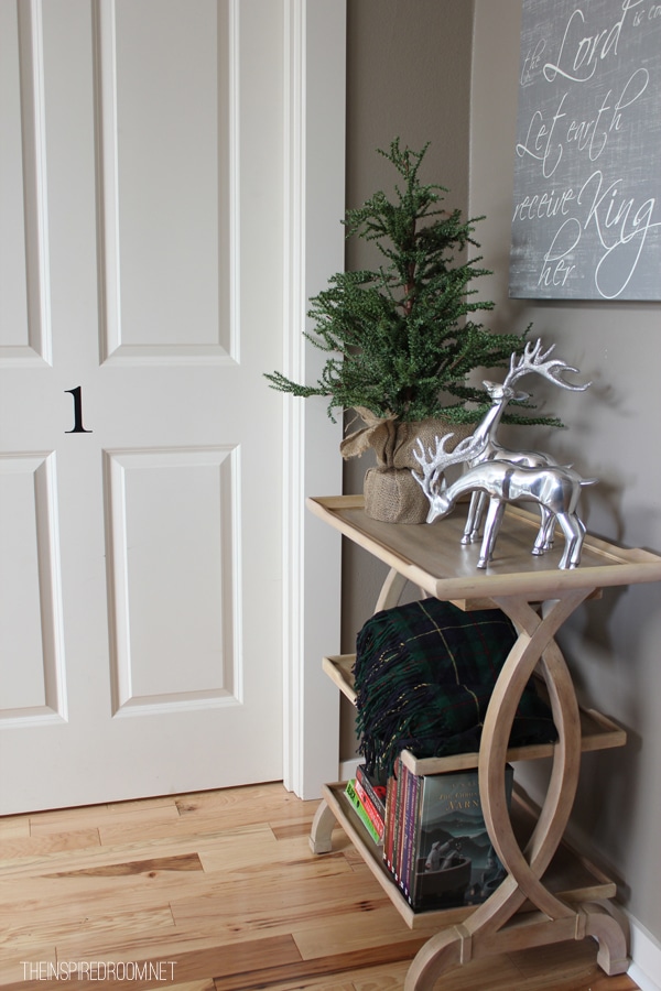
Hi Melissa, what beautiful and soothing ideas for holiday decor! I am in love with the 3-tier bookshelf in the photo with the door with the “1” on it. It would be perfect in my dining room. I tried to find a post about it but could not find it in your “shop my home” post. Would you mind sharing any info on it, if you have it? Thank you.
Norway is the palette I am most drawn to. Even though they tend to do a lot of white, their spaces always have a sense of warmth to them.
I am torn between Norway and France. I always paint around the holidays also, I guess to freshens things up. Thank you for the chance to win this giveaway.
The good old colors of the USA. Have always gone back to classic blue & white china after forays away!
Anyway, colors of Norway are a second choice. Thanks for the chance to win.
I love the colors of both Italy and Germany!
I would love my living room walls painted in the rich navy of Japan!
Though I love the Colors of Italy, especially after finally getting to visit in 2014, my PNW house is more Colors of Japan. Adding some of those Cinqe Terre colors in artwork.
The color palette shown for Japan was a complete surprise to me. I would not have attributed those to Japan, but those are the colors I am drawn to for my home. We lived in India for three years, so I enjoy adding pops of red and peacock blues to the rooms now that we are back home. Thanks for the view into Epcot’s new exhibit and for a chance to win the gift card!
I like the colors of the UK!
I actually love the USA color palette! :-)
Would love the gift card. I love canada’s colors
Love the soothing colors of Norway!
I was surprised that the colors of my house are China. The colors I like are Japan and Canada. . . hmmm.
I would love the Norway colors!
When I clicked on the link the first thing I saw was the fabulous colors of Morocco and I KNEW what my choice would be. But, to be sure, I dutifully clicked on each country before totally screaming MOROCCO! :)
My first pick was the colors of Japan….then I continued to look and I found that I like them ALL!…I see colors I love in each country. Can’t decide if that makes me indecisive or simply open to anything?!!
I liked the french colors including the purple.
I am really leaning toward Italy.
Norway!
As I look around my home at all the neutral beige, grey and blues I use to give each room life I have to pick Japan! I’d love the chance to pick out some of those rich blue Glidden paints for accent walls in our new condo (we have a lot of white walls right now)!! I agree with nesting this time of year in Seattle and getting house projects done!
Love the colors of Norway. Thanks!
I have decided that I really need “plain and boring” walls because I like to change color plans all the time.
The colors of Norway is my personal favorite. It just exudes effortless chic.
I was most inspired by the colors of Norway which actually surprised me a little. I love soft colors and hadn’t really thought of Norway as a land of soft colors.
I love the colors from Japan. They really do feel calming and I think our house could definitely use some of this on any given day!
We are painting all the rooms in our house right now – so this post literally hits home. We recently purchased our first house and are enjoying remodeling DIY-style together. I think the Norwegian bedroom is lovely, the Canadian palate is warm and cozy, and the pop of teal in the UK scheme is perfect.
Colors From the U.K. These colours feel a lot like my most recent paint purchases! Love them.
You put into words exactly what I was going through in my own house with paint color. My living room had green walls, a pretty green at that. The room just wasn’t comfortable or “pretty” to me. I changed the area rug to white thinking it would brighten things up. It did but I still wasn’t happy. I bought a light tan ottoman for a coffee table (mostly for grandson safety) but also to brighten things up. Eh! Then I went for it and painted the walls shaker beige. Aaaah! I loooove the room now. It makes me happy to walk by and look in. It makes me want to go in! Paint made all the difference.
Yay! So true, it’s funny how we sometimes try everything else to fix it but if we just get the paint right we are happier! :) Glad you found the right color for your house!
I was most inspired by the Colors of Italy palate. Thanks for offering the Home Depot giveaway. I’d love to win and go buy more paint!
I’ll have to say I just LOVE the colors from Norway! They remind me of the simple joys and natural elements of the outdoors of Alaska. I’ve always loved the neutrals but also like little pops of color throughout my home. The Norway post perfectly combined all the basic neutrals (so similar to the colors of the caribou in Alaska!) with the rustic charms of evergreens, worn-out cabins, and long winters of Alaska. Just perfect! I can’t wait to get started on pulling ideas from these colors into revamping my home during this holiday season for my family guests coming for Christmas. Thank you for sharing!
I was inspired by the colors from th U.K. I love the grays, mauves and teal. They are romantic colors. What a fun way to think about color.
I love the colors of Japan! I have always loved the combination of blues, browns, tans, , and soft whites/creams and have just recently added greys to the mix! Love this combination as it restores calmness and serenity to me after a busy day!
I really liked the colors from Japan! They were surprising and I fel inspired to paint right away!
Wait! I chose Japan because of the serenity in color palette. But, I had trouble on my iPad seeing all the other choices (I had wondered why there were so few choices–so I went back to reinvestigate the offerings). Lo & Behold! Italy & France! I am a mix of the two, but if I had to choose one, it would be France! Now, these colors are a better fit for my personality and colors that just “speak” to me–I almost want to “eat” colors I love, if that makes any sense!
Love the Canadian color scheme. I’m a warm color person!
So hard to pick just one,but I gravitate most toward colors of Japan :)
I love the Norway colors
I was inspired by both the U.K. and Norway. Beautiful color schemes!
Colors from Japan. Very pretty!!
I lean more towards the Canada color pallet. I like the warmth these colors make a room feel. Of course it could have something to do with living in MI and being a Canadian neighbor ;-)
Oh my I love the colors of the UK!!! That’s the exact palette (with the addition of a dark teal) that I’ve been building my house towards but couldn’t find a way to refine the what, how and why of what I wanted.
And it’s so true some houses are suited for specific colors. I love red, it’s my favorite color, but the house didn’t feel right with it. I still have it in my office area because I love it but the rest of the space needs cool tones like the UK colors. Don’t know why but it does!
I love the colors of Norway.
The colours of Morocco stirred something in my soul.
Colors from Norway are so pretty! I love them.
The colors of Japan are the closest match to what I would choose to paint my home interior and exterior.
I love the Medici Gray
I love the colors of the UK, but the colors of Japan are the ones I would like to use in my home. To me there is a little more warmth in them. Thanks for the chance to win!
I am shocked to find the colors I gravitate toward in Norway! It had seemed to me to be a “cool” color country. Is this a sign that I should do more traveling? This exercise is just the thing for choosing the color of white for my living room. Colortopia site was fun to explore. Thanks for the tip.
I love the colors of Norway!
Canada!
Love the Colors of Italy with the strong Tuscan influence. Those have been popular for a long time, but I think they are trendy again now.
I definitely gravitate toward the colors from Norway. I like their natural feel.
I love the colors of the U.K and also Germany.
Love the colors from Canada.
The UK colors were gorgeous! Definitely my favorite!
What a great idea! This is a hard choice, but I think Morocco!
I like the Italy and Canada colors the best, although probably would be most likely to choose Canada for my own home.
I like the colors of Italy.
The color combinations are all great, but I’d have to say my favorite is Norway. I love that
they are muted and have a clean, relaxing appearance. Thanks for the giveaway!!
I love the colors from Morocco!
Melissa!
I liked the colors from Japan before I saw they were yours! Ha! Sue hope to win!
Blessings,
Michelle
I like colors from the UK.
I love the colors for Germany!
The jewel tones of Morocco make my heart sing!
I love dove white from colors of Japan.
I really like the peacefulness of the neutral Japan colors.
My country is France. I actually took photos while in France to use as inspiration. Jo @ Let’s Face the Music
Japan & Norway, i can’t decide